Prior to engaging Limitless Design, our client had previously engaged a graphic designer to create a unique packaging design for their product. The old packaging design was generally not favourited by the client and his partners, citing them, "The design was overall, too dark and gloomy, and the front design does not fit into the panel, so many of the important information were missing at first glance."
PROJECT
Background
NuTreeGut Limited is a UK-based company, that sells synbiotics (a mixture of prebiotics and probiotics) powdered drinks that are fully plant-based and vegan-friendly.
Drag arrow to see before & after
OVERVIEW OF
Design Process
DESIGN PROCESS
1. Study
We hopped on a video call with our client to fully understand the problems they faced. We also took our time to understand the client's target market and their competitors in the same industry.
BRIEF
Packaging Design
EXPECTATIONS
Fresh Friendly
TARGET AUDIENCE
Vegans Adults Age 24 to 64
DESIGN PROCESS
2. Propose
Following our client's brief, as well as further product and market study, we managed to pinpoint several design problems and proposed new ones.
DESIGN PROCESS
3. Ideation & Prototype
We gathered our reference materials and started putting on our creative hats.
DESIGN STYLE
Fresh Friendly
TYPEFACES
Proxima Nova
Inter
COLORS
Fresh Green
TOOLS USED
Adobe Illustrator
Adobe Photoshop
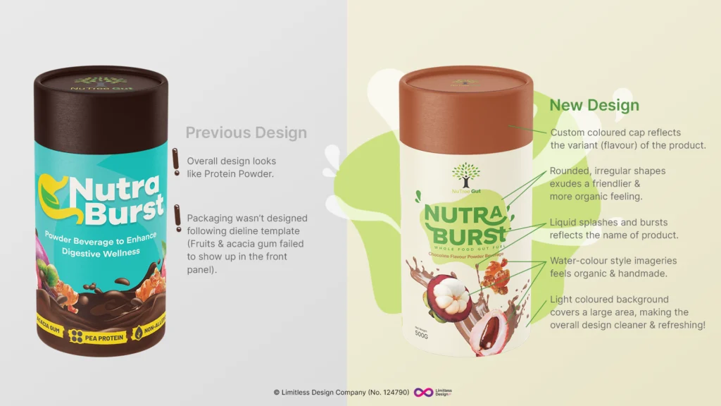
an image showing the custom illustrations and typography used in nutraburst by nutreegut, created by limitlessdesign.asia
an image showing the vector icons used to highlight the unique selling points of nutraburst by nutreegut
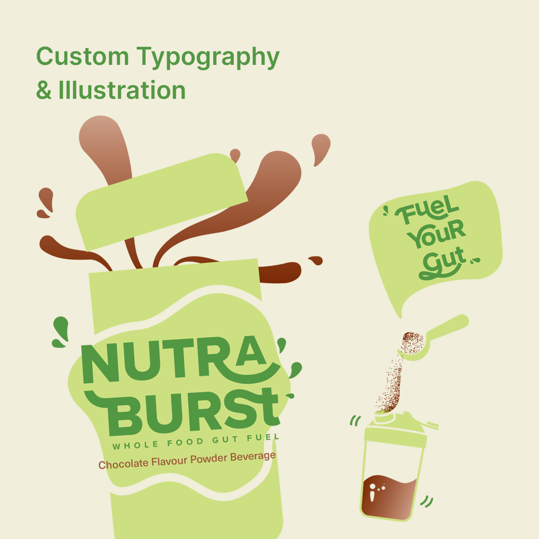
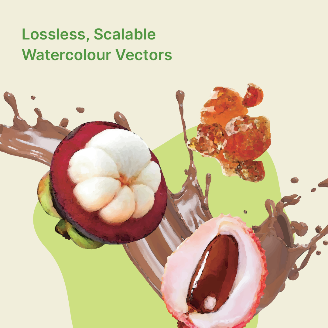
an image with liquid burst, mangosteen, lychee and acacia gum, a unique formulation of nutraburst by nutreegut
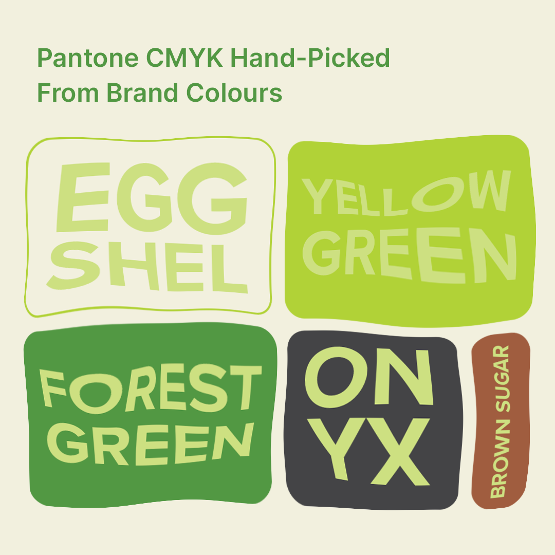
an image showing the pantone cmyk colours used for the new packaging of nutraburst by nutreegut by limitlessdesign.asia
DESIGN PROCESS
4. Final Result
nutreegut.com
CLIENT'S TESTIMONIAL
As a start-up based in the UK, the difficulty was to find a designer with an appreciation of European consumer tastes where less is more and simplicity is favoured over busy design and garish colours. I submitted my current design and asked for a quote to resize the label with some design elements added. I was surprised to receive a completely new design. At first I was shocked but then my partner looked at it and remarked how beautiful it was. I proposed a colour change which Shay Mei readily obliged with no complaints. What was surprising was how she even offered to scrutinise the product name according to Malaysian food labelling regulations! Wow..just wow! She then worked at pace to meet our deadline with final touches and some recommendations from a UK designer. I really can't commend Shay Mei enough for her great work. She is a pleasure to work with and shows great initiative.
Tahir Ali, Managing Director of NutreeGut Limited
Did you like this case study? Share it with someone you know: