To improve their sales, Nanyang Spice needs a fresh new look that caters to the local consumer's aesthetics preference and taste.
PROJECT
Background
Nanyang Spice exports traditional coconut sugar made in Malaysia (produced by CocoWorld) to Japanese consumers. The product packaging comes in 2 sizes.
Drag arrow to see before & after
OVERVIEW OF
Design Process
DESIGN PROCESS
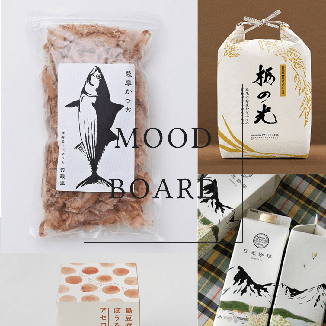
1. Study
After studying various Japanese product packaging designs, we realised Japanese consumers have a different aesthetics preference when compared to Malaysian consumers. Most of the product packaging designs in Japan are minimalistic and uses “Earthy” colours, such as green, yellow, beige, reddish brown, black and white. They also use illustrations to reflect the nature & unique selling point of the product, as well as the target consumers the products sell to.
BRIEF
Packaging Label Redesign
EXPECTATIONS
Creative freedom was allowed
TARGET AUDIENCE
Japanese consumers; housewives and young adults
DESIGN PROCESS
2. Propose
Upon collecting reference materials, we drafted 2 design styles for our client to choose from.
DESIGN PROCESS
3. Ideation & Prototype
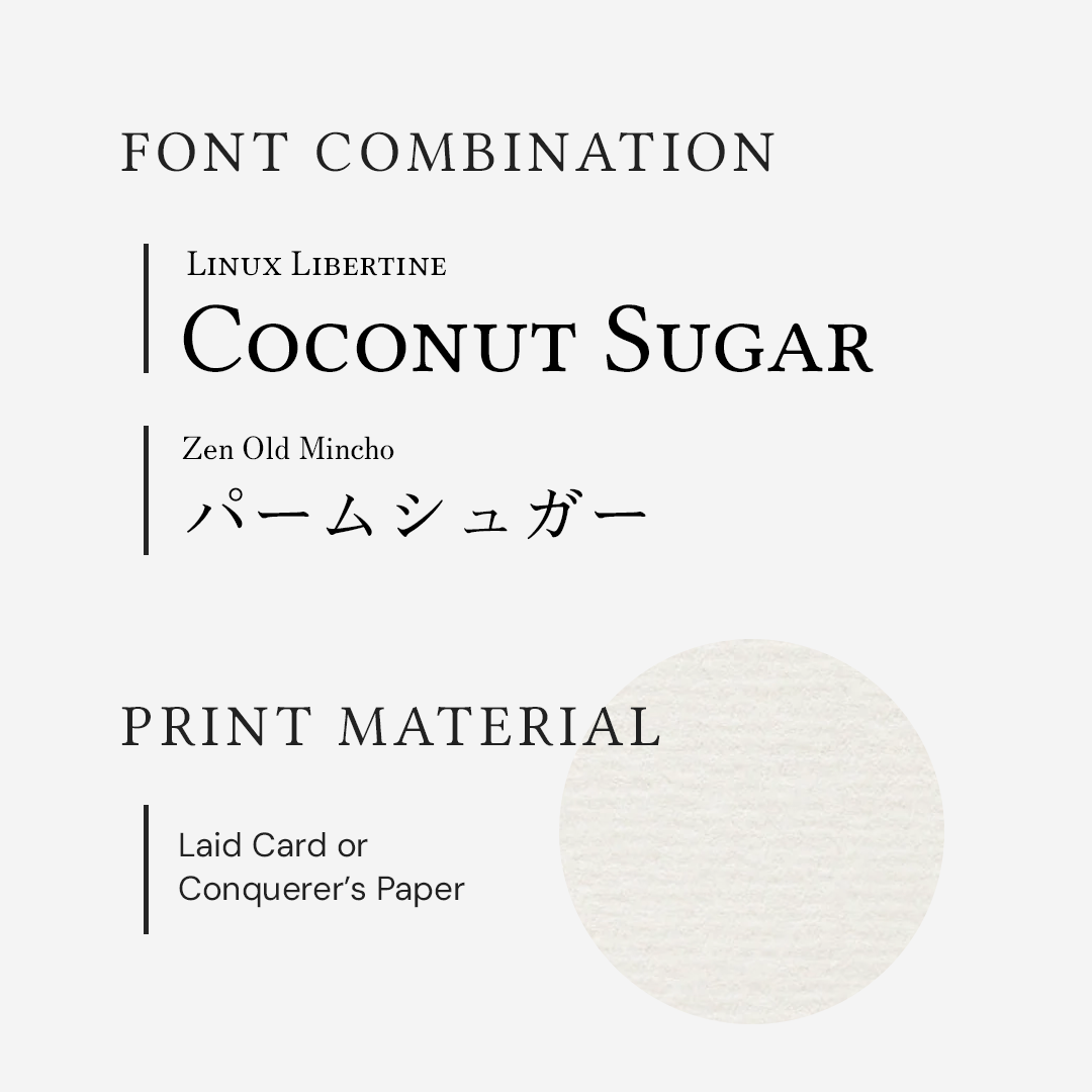
Our client prefers Style B. Upon agreement, we refined the designs further and made sure that the copywriting, measurements, fonts and colour palette used present the most optimum results - clarity and beauty.
DESIGN STYLE
Minimalistic, Watercolour Painting
TYPEFACES
Linux Libertine
Zen Old Mincho
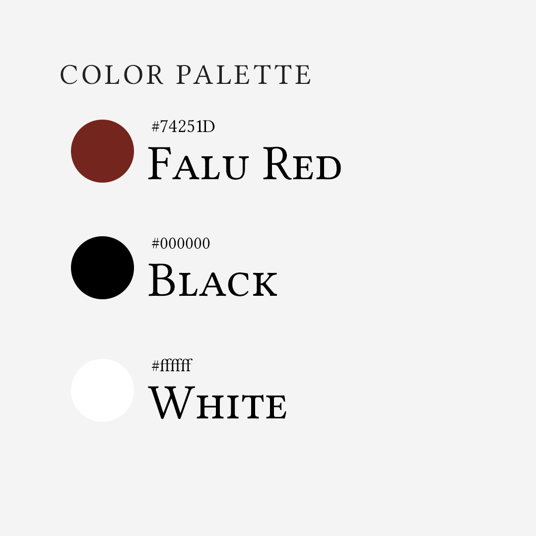
COLORS
Brand Colours
TOOLS USED
Adobe Illustrator
Adobe Photoshop
DESIGN PROCESS
4. Final Result
CLIENT'S TESTIMONIAL
N/A
Cocoworld (For Nanyang Spice)
Did you like this case study? Share it with someone you know: