ABOUT

Logo Redesign

CLIENT

Evercare Manpower Agency (EMA)

DURATION

2 Weeks

OUR ROLE

Graphic Design & Consultation

STATEMENT OF

Problems

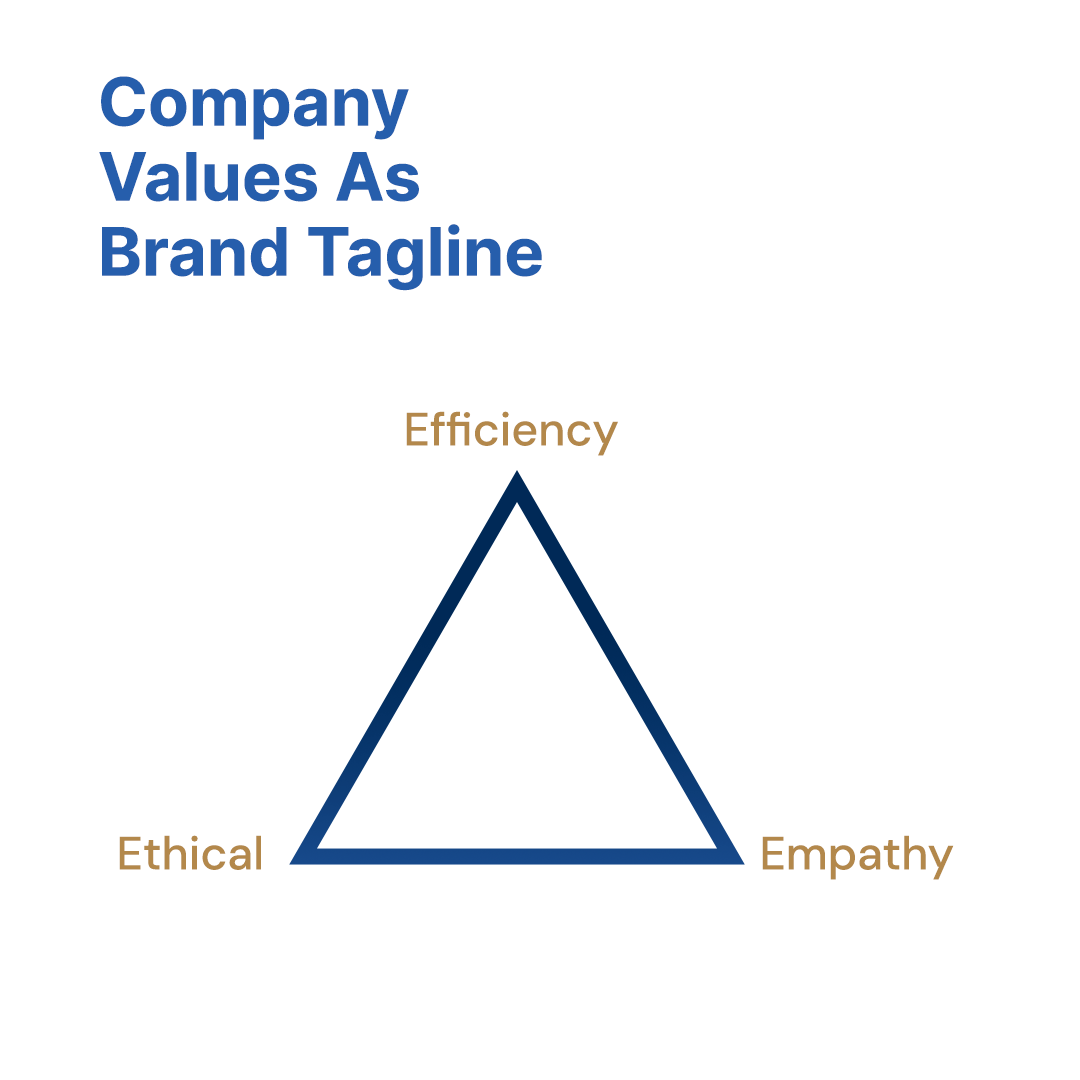
Evercare Manpower Agency (EMA) is a company with a long establishment history. The company recently branched out a newly formed company that serves a different market segment, called Z Talents Solution (Click here to read case study). To unify both brands housed under the same company, EMA needed a new logo with a more modern and polished look.

PROJECT

Background

EMA's success is built on 3 company values - efficiency, empathy and ethical. The company founder stood strongly by these 3 values. The new logo must include the word EMA and it must reflect its business nature, old brand identity and prestigious establishment.
Before-After-EMA-Old-Logo Before-After-EMA-New-Logo

OVERVIEW OF

Design Process

DESIGN PROCESS

1. Study

First, we hopped on a video call with our client to understand their needs & concerns. After studying several HR companies that serve similar industries, we put on our creative hats to start drafting the logos.

BRIEF

Logo Design

EXPECTATIONS

Corporate, Modern, Professional

TARGET AUDIENCE

Manufacturing Industry, High School Leavers

DESIGN PROCESS

2. Propose

With the brief in our hands, we presented 3 logo design styles to our client.

DESIGN PROCESS

3. Ideation & Prototype

After the first round of selection, we further refined the design to put together a balanced logo that is applicable for all orientations and canvases.

DESIGN STYLE

Corporate
Professional
Modern

TYPEFACES

Inter
DM Sans

COLORS

Corporate
Logo Redesign: Evercare Manpower Agency (EMA)

TOOLS USED

Adobe Illustrator
Adobe Photoshop

DESIGN PROCESS

4. Final Result

CLIENT'S TESTIMONIAL

It's a pleasure working with you as always ✿

Fionn Tan

Did you like this case study? Share it with someone you know:

START A PROJECT TO

Elevate
Your Brand