As a law firm that engages with local and international clients, Paige and her partners needed the brand to appear professional and apply both English and Mandarin characters in the logo. She had the vision for the logo, but was unable to execute the design professionally.
PROJECT
Background
SP Hew & Khoo (Advocates & Solicitors) is a property law firm based in Kuala Lumpur, Malaysia. The law firm represents local and international clients and provides the clients legal advice involving the ownership of various forms of property.
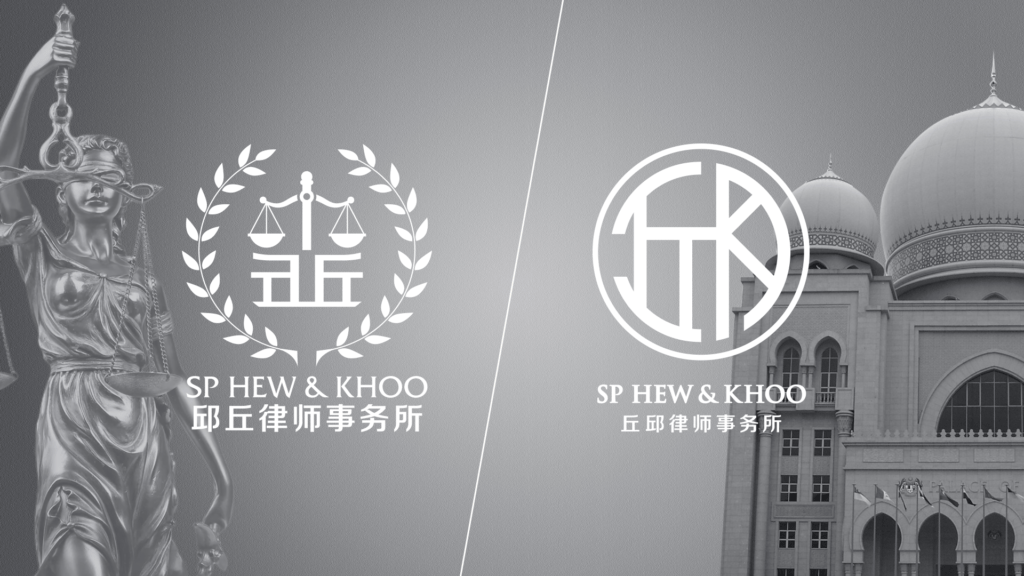
Drag arrow to see before & after
OVERVIEW OF
Design Process
DESIGN PROCESS
1. Study
After a phone interview with Paige, we understood her needs, style expectations and colour preferences. We were excited to transform her ideas into visual designs and we came up with a selection of draft logos.
BRIEF
Logo Design Business Card Design Letterhead Design
EXPECTATIONS
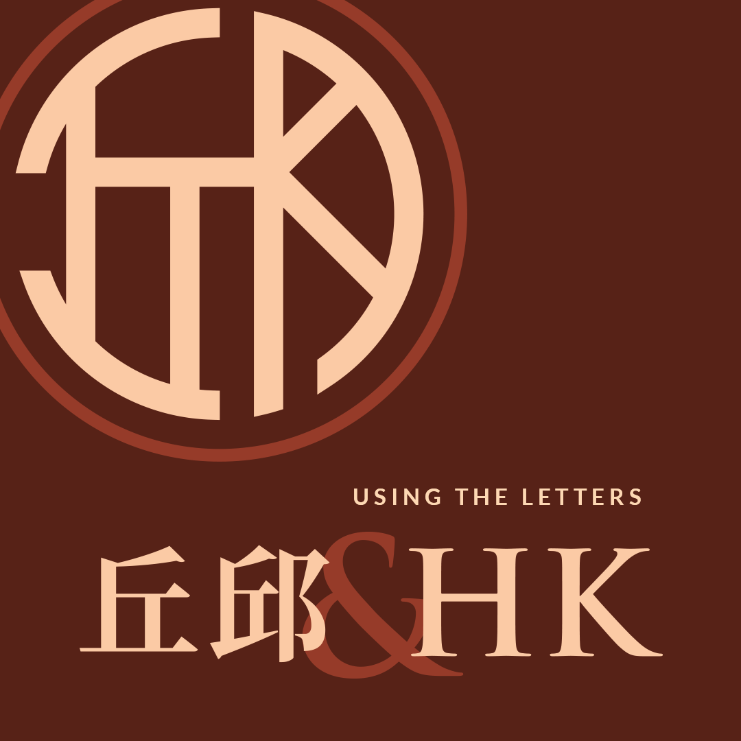
Corporate Logo Incorporates both partner's Chinese and English surnames
TARGET AUDIENCE
Local & international businesses
DESIGN PROCESS
2. Propose
With the brief in our hands, we put together a presentation of 2 design styles for our client.
DESIGN PROCESS
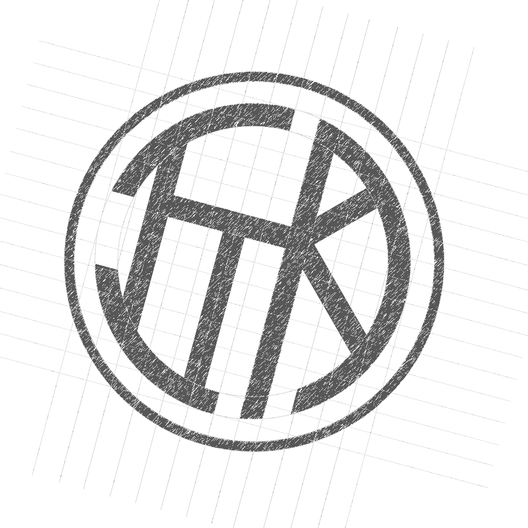
3. Ideation & Prototype
Following the agreed upon design style, we put on our creative hats to compose rough sketches, gather suitable fonts (typefaces) and color palettes.
DESIGN STYLE
Corporate Monogram logomark
TYPEFACES
Trajan Pro
Lato
COLORS
As preferred by client
TOOLS USED
Adobe Illustrator
Adobe Photoshop
Microsoft Doc (Ready-to-use letterhead template)
DESIGN PROCESS
4. Final Result
CLIENT'S TESTIMONIAL
"Your representative was very helpful and patient. Most importantly, she understands our idea of the logo."
Paige Hew, Parter at SP Hew & Khoo
Did you like this case study? Share it with someone you know: